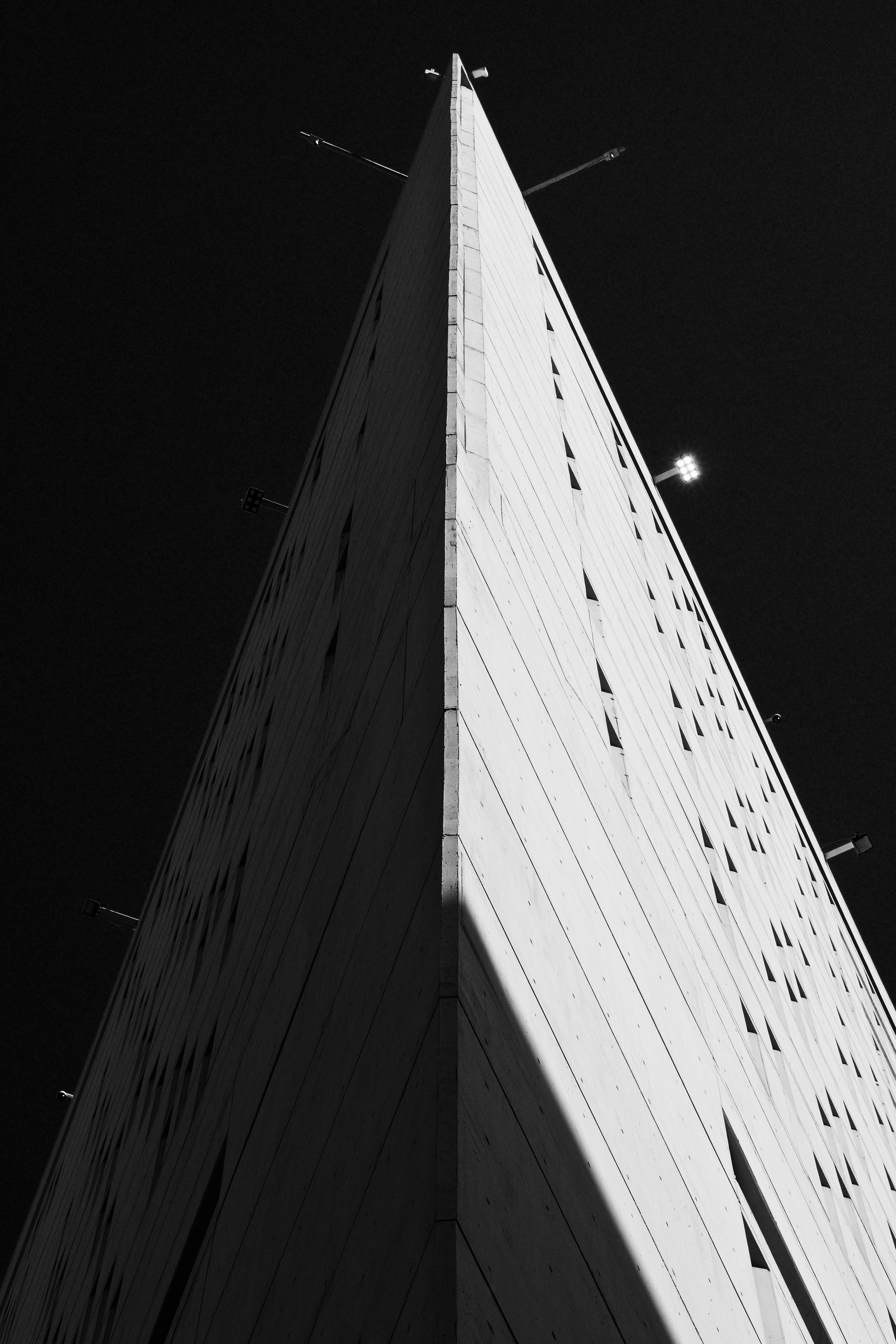
Metropolitan Correctional Center by Adrian Galli

MCC

MCC

It is a building that is oddly compelling given its function within Chicago. I have aspired to photograph the Metropolitan Correctional Center for some time and it hasn't been easy. What is in my mind for how to capture its design would require me to acquire permits and that, as it is a government building, sounds challenging.

Having gone out to photograph an entirely different subject, I decided to walk down to the MCC for a brief scout. I had no intentions of finding a shot I wanted but the light, like Shadow and Light (Art Deco Mountain) was just was what I needed to see.

It is funny how you go out, perhaps only partially successfully, to shoot one thing and end up finding something entirely different to photograph.

Shadow and Light by Adrian Galli

Art Deco Mountain

Art Deco Mountain

Certainly, one of the most important aspects in photography is learning how to control light and when to use shadow. These two elements can so dramatically change the mood and even the entire appearance of the subject to the extent that the subject may not be recognizable.

It is the photographing of ordinary things, in extraordinary light, which results in extaordinary photographs.
— David Young

Instagram Gets Modern by Adrian Galli

Instagram's new icon.

Instagram's new icon.

What does his mean for the hipsters? 

After years of waiting and hoping, Instagram gets a new icon and a mordernized interface. As one of my favorites in social networking, I'm pleased to see it moving forward... admittedly, I'm not sure about the icon. I don't think I'm thrilled with it but the hurrah over how "ugly" it is seems highly exaggerated. 

The interface is overall much cleaner and I could see these changes coming with some adjustments made in the app recently such as flatter, less colorful UI features.

Technology is like a fast moving river. One can try to swim against the current and fail. One can also get swept away in the flow of water into confusion; perhaps drown in it. Or one can navigate the river like so many pioneers before and use the waterways to one's advantage. 

My experience in the industry, many fight changes in technology and cause themselves much frustration and irritation. Technology is change. I have made my way navigating the technological river and built a huge skill set rivaled my few.  

For right now, the icon is fine and the interface is great. Besides, if a change in icon is the worst thing to happen to a beloved app, consider it a first world problem like having too many choices at one's favorite burrito joint.

The *real* problem is that the new icon doesn't go with any of the other icons on my home screen.